Type Directors Club
A New Chapter for a Storied Organization
The Challenge
Those of us in the design community are no stranger to the Type Directors Club. Yet after 70 years, the membership association’s numbers were stagnant. Outside of its annual competitions, the TDC was struggling to tell its own story.
The Outcome
Rather than rebrand, we reinvigorated the existing system, elevating opportunities to speak up and stand out. We generated as many ideas as possible for galvanizing public interest and zeroed in on three key areas: communication strategy, digital experience and membership outreach. We poured our energy into a welcome kit and website designed to remind the world that when it comes to type, the TDC reigns supreme.
We prioritized member outreach and revamped its digital presence to re-assert the TDC’s voice and value.
A PLAYFUL BRAND POSITION
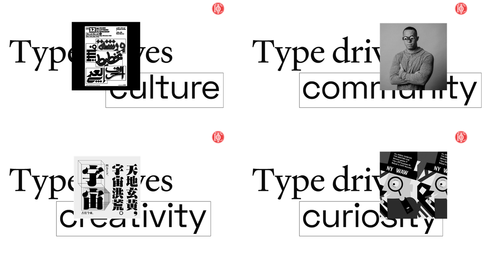
From tiny type generators to Wes Anderson title screens, type has stepped confidently into the collective consciousness. Recognizing the opportunity presented by more people taking an interest in type, the TDC adopted a new positioning statement. Equal parts provocative and playful, it’s ripe with potential for witty wordplay and secondary messaging.

WEB REDESIGN: TELLING THE TDC STORY
We reorganized the information architecture and created a values-based top-level menu, giving visitors a sense of what the TDC’s all about: Recognizing Excellence, Supporting Growth and Building Community. Then we cleaned up content so they could quickly take action.

HOVER INTERACTIONS
Hover interactions within interactive text boxes sprinkled throughout trigger related imagery, tagged with specific keywords.
REINFORCING THE BRANDMARK
Round tags and a custom cursor are a nod to the TDC mark, boosting the brand at different touchpoints.


RULES AND LAYERS
Exposed rules create structure, while layering defies it. A little friendly mischief can convey great confidence.
COMMUNICATION STRATEGY: CREATING CLEAR GUIDELINES
We took stock of every TDC channel, articulating clear goals and recommendations for each, from Twitter and Instagram to competition microsites and TDC central. Coupled with brand guidelines, those recommendations coalesced into a robust, user-friendly resource.
WELCOME KIT: MEMBERSHIP OUTREACH
Low-hanging, yet oft-neglected fruit: showing gratitude to the folks who make you what you are. To welcome new members to the TDC community, we designed a thoughtful print piece, equal parts sophisticated and curious, with a strong dose of storytelling.


Type, Texture and Layers of Meaning
We used typographic gestures, photography, different color stocks and die-cuts to capture the full expressive range of the TDC — from authoritative to eccentric. Layered, nested sheets and peak-through moments reveal the many ways type affects culture, creativity and community.


Repeating Elements
Inner nested sheets feature anchoring elements like the TDC dot, tying the tactile back to the digital space for a harmonious, end-to-end member experience.


Stats and Impact
-
550
Additional daily users after site relaunch
Upon launch, the TDC.org saw a huge spike in traffic. The organization’s social media manager dove headfirst into the Brand Guide, reporting back the value of having all brand everything summed up so concisely in one handy resource. And over on Instagram, user @vivastruble perhaps summed it up best: “🔥🔥🔥.” We’ll call that a success.


