STEAMe
Connecting the tracks, fueling the future.
the challenge
STEAMe envisions a future where everyone has access to prosperity. With millions of unfilled jobs, STEAMe’s platform powers workforce development pathways to employment, to propel mobility, prosperity, and resilience across communities. Their technology connects learners, learning providers, intermediaries, and employers to fuel career exploration, reduce stop outs, and ensure employers get people with the right skills into the right jobs at the right time.
Recognizing that current systems often fail to deliver lasting impact and economic mobility, STEAMe partnered with Firebelly to craft a brand narrative and visual identity that reflects their mission: to be the engine for workforce transformation so everyone reaches their highest potential and communities flourish.

OUR APPROACH
Our approach began with deep listening: immersing ourselves in STEAMe’s mission and values, as well as first-person interviews with the product team. Through collaborative discovery, we crafted a verbal identity that demonstrates their platform’s ability to connect learners with opportunities in the workforce — and future prosperity. From there, we refreshed their visual identity, preserving key brand elements while creating a more flexible, cohesive design system.
Brand Narrative + Pitch Kit
STEAMe needed a brand narrative as a north star to guide their marketing, product, and user experience decisions. We partnered with them to develop their brand narrative, a core piece in STEAMe’s brand strategy. The result was a pitch kit that helped STEAMe share their mission and tell their story to potential partners and customers.


Identity
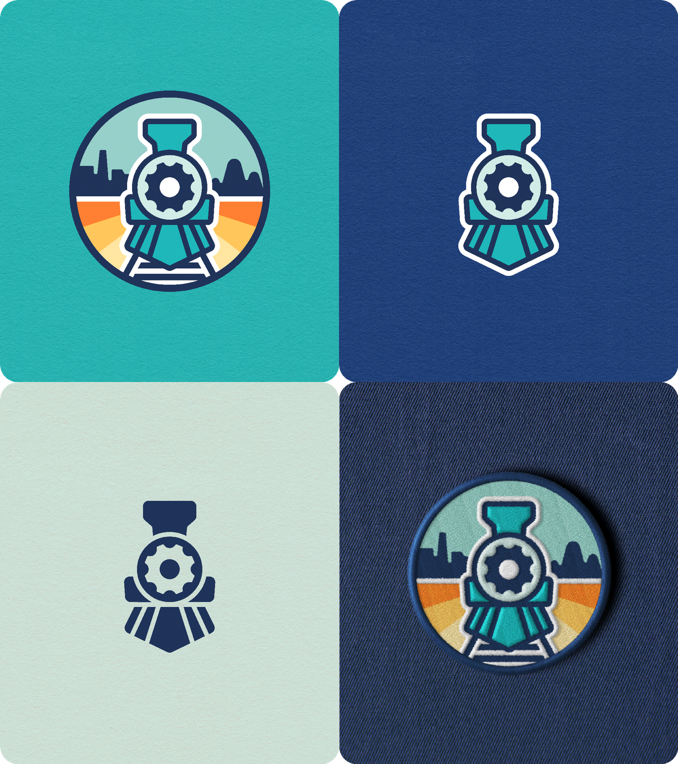
Building on STEAMe’s vision of a steam engine as their symbol, we evolved their logo to better embody their mission. The train, set against an expansive sky, symbolizes forward motion and possibility, while the backdrop of cityscapes and mountains reinforces their mission of connecting all communities on the journey toward workforce opportunity.
The wordmark ties into this theme by linking letters with a path to subtly highlight the “Me” in STEAMe, reflecting the brand’s focus on individual journeys and personal connection.


The resulting logo system offers a spectrum of expression: the primary mark is the fullest expression of the logo, serving as a vibrant centerpiece for brand moments and merchandise. For versatility, we crafted a secondary mark focusing on the train itself, while a simplified tertiary version adds clarity in the digital product space, when legibility at smaller sizes is crucial.
Firebelly helped us take the concept of the steam engine — a symbol of transformation during the Industrial Revolution — and modernize it for the workforce of today and tomorrow, laying the tracks for a dynamic brand that embodies innovation, personalization, forward momentum, and prosperity for all.
—Rachel Kohler, CEO
Colors

The palette leads with shades of blue and is supported by a variety of soft, optimistic hues. The lighter colors offer quiet accents in everyday applications, while vibrant pops of color offer more energetic options to lean into for external campaigns.
Icons
Supporting graphics are built from a versatile kit of parts inspired by modular systems and the punched corners of train tickets, and offer a variety of shapes to draw from in creating icons and illustrations.
Icons consist of solid and dashed, track-like lines that speak to planning and future possibility, and may be set against a suite of flat color backdrops.


Design + Activation
The style guide ties all the pieces of the system together, with examples of the identity applied across digital and print applications.


“Firebelly helped us create a dynamic brand that embodies innovation, personalization, forward momentum, and prosperity for all.”
— Rachel Kohler, CEO


