R2 Companies
Modernizing a Maverick Firm
THE CHALLENGE
The creative contrarians behind Goose Island’s rebirth, R2 has a nose for irreplaceable real estate and an eye for potential. Despite an impressive portfolio and track record, the firm’s story (and success) flew under the radar. Until now.


The Solution
We pored through spec sheets and toured raw spaces with the firm’s principals to learn just what it is that drives R2. And we found it — the relentless pursuit of opportunity, a fearless focus that became the cornerstone for a minimalist brand.
A CAPABLE, CUSTOMIZED SYSTEM
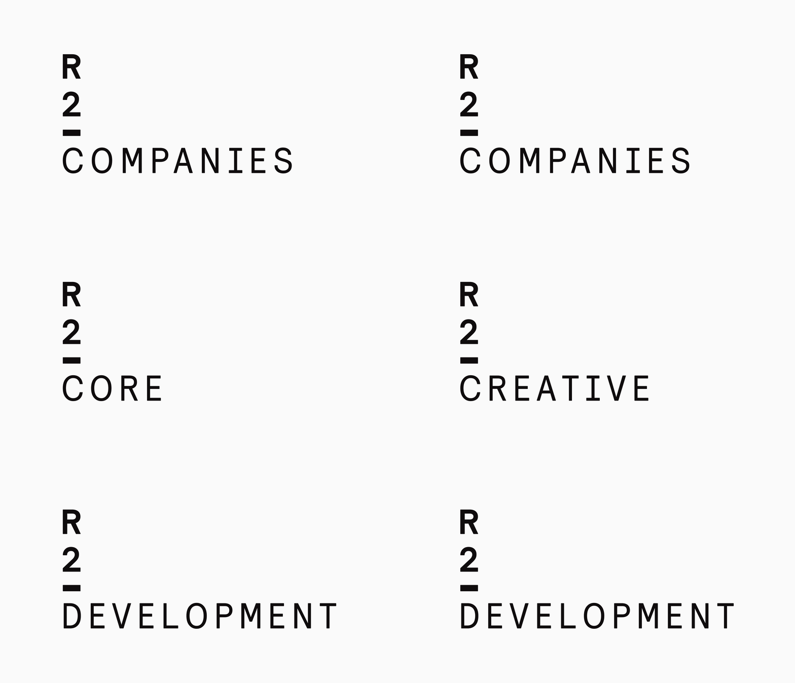
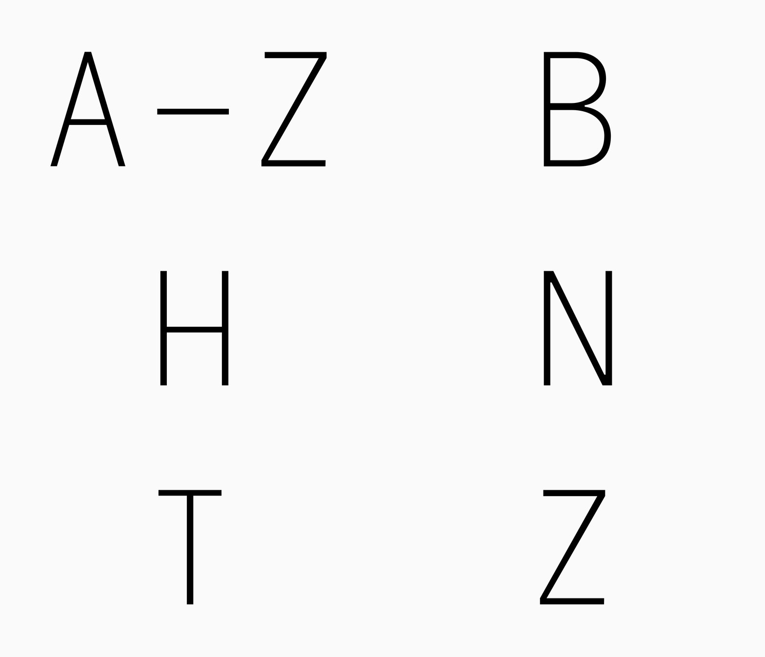
From investment to development and leasing, R2 brings a design studio’s sensibility to each project. The adaptive logo highlights their core services and taste for thoughtful, technical detail. Drawing inspiration from Relative and Relative Faux, the custom display type allows numbers (i.e. addresses) to stand confidently on their own.


“As a design-centric real estate developer, that toes-the-line between hospitality and commercial office, we needed a partner that would understand and be patient with our eccentricities.”
— Zack Cupkovic, Director of Special Projects
FLEXIBLE FOLDER KIT
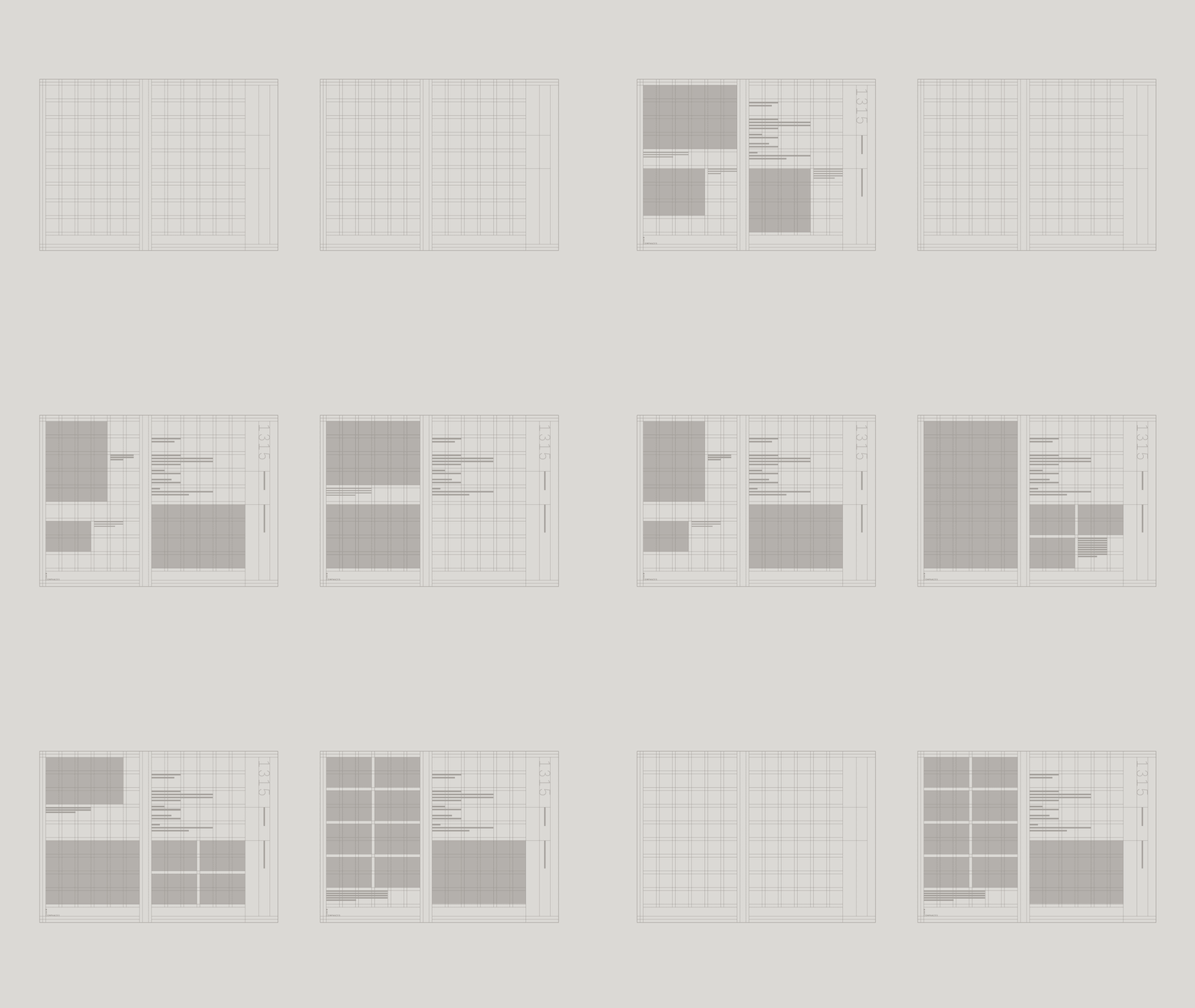
Print collateral is key to R2’s business. Understanding the need to adapt their approach from day to day, deal to deal, we developed an adaptable kit where floor plans, brochures and personalized note cards could be swapped in and out with ease.


MODULAR templates
A variety of leasing sheet templates help the firm’s internal design team play to the strengths of each unique property.


FUNCTIONAL floor plaNS
A minimalist style atop a visible grid keeps with the brand’s sharp, technical aesthetic.


“We don’t need to name our projects. Let the numbers do the heavy lifting.”
— Matt Pistorio, Principal
STATIONERY

notes, cards + letterhead
Subtle and streamlined, R2 stationery works with the neutral tones we saw throughout their office, with an eye-catching dash of accent red.


sleek signage
With our work underway, R2’s Goose Island HQ got a massive facelift in the form of a dazzle camo mural in stark black and white. Where once you could easily pass through Goose Island without ever knowing you were there, the building now commands attention. We designed spare, sleek signage to complement, rather than compete with, the overhaul.


PORTFOLIO WEBSITE
Simple yet sophisticated, the new site houses only what’s needed — nothing more, nothing less. The filterable portfolio and team pages put the focus on what matters most: R2’s experience, expertise, talent and impact. For a good time, check out the before-and-after sliders on individual project pages.
“We are very excited to have a brand identity that celebrates our successes, but is also a framework that is designed to evolve as fast as we do.”
— Zack Cupkovic, Director of Special Projects


CREATIVE PLACEMAKING: GOOSE ISLAND
And now for something completely different…Throughout our work together, we explored the idea of a local campaign to shine a floodlight on Goose Island’s evolution from abandoned lot to Island of Opportunity, a blank canvas with a touch of grit and a whole lot of potential.


On Goose Island, there’s room to become just about anything.


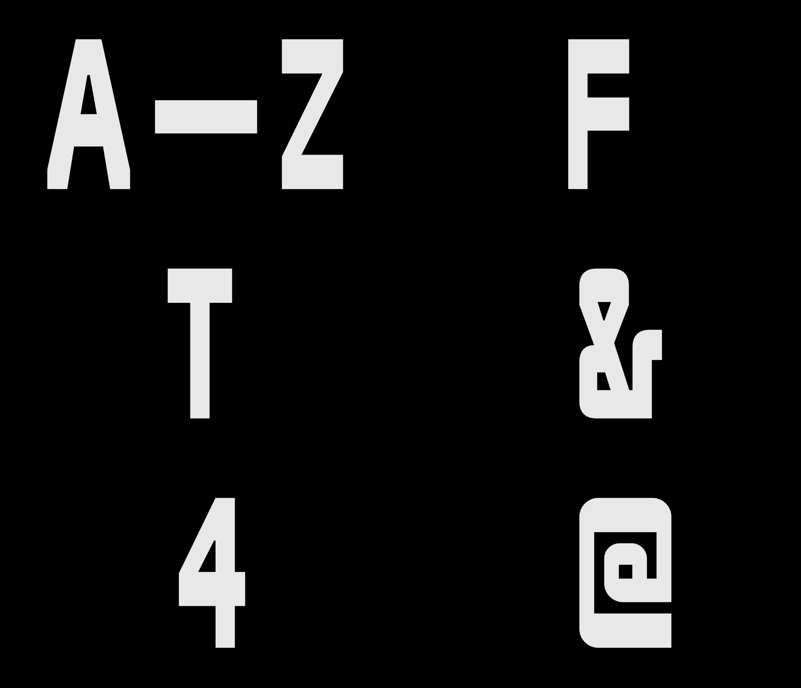
Scratch-off effects, stickers, neon accents and wordplay — along with a chunky, condensed custom font — honor the island’s industrial history while creating a sense of playful possibility. Subtle allusions to R2 maintain the connection between the space and firm, while allowing the project its own personality. Here’s to a future full of opportunity.