Joy Machine
A Joyful Identity for a Neighborhood Chicago Gallery
Our Approach
Joy Machine is a contemporary art gallery in Chicago's Irving Park neighborhood that transforms how people experience and connect with art. Founded by Grace Ebert and Christopher Jobson, the gallery balances serious artistic pursuit with joyful discovery, positioning joy as an essential catalyst for change and connection.
What We Delivered
What sets Joy Machine apart is their thoughtful approach to finding meaning in wonder. They act as more than just a space for art — they’re a spotlight illuminating new perspectives in contemporary art, carefully curating works from both emerging and established artists. Their philosophy stems from a belief that art should do more than exist — it should open up new possibilities and ways of seeing the world, while remaining grounded in purpose and authenticity.

Identity
The logo reflects this spirit with an open typographic frame that invites viewers to pause and engage. The rotational wordmark, set in Marund Corner, balances mechanical precision with playful expression, reflecting the duality of its name. With “Joy” at the top, and “Machine” curving into a smile, there’s a subtle nod to Chicago with the quick read of“JOY” and“CHI.” Its square form offers flexibility across formats, serving as a blank canvas for artwork and motion.
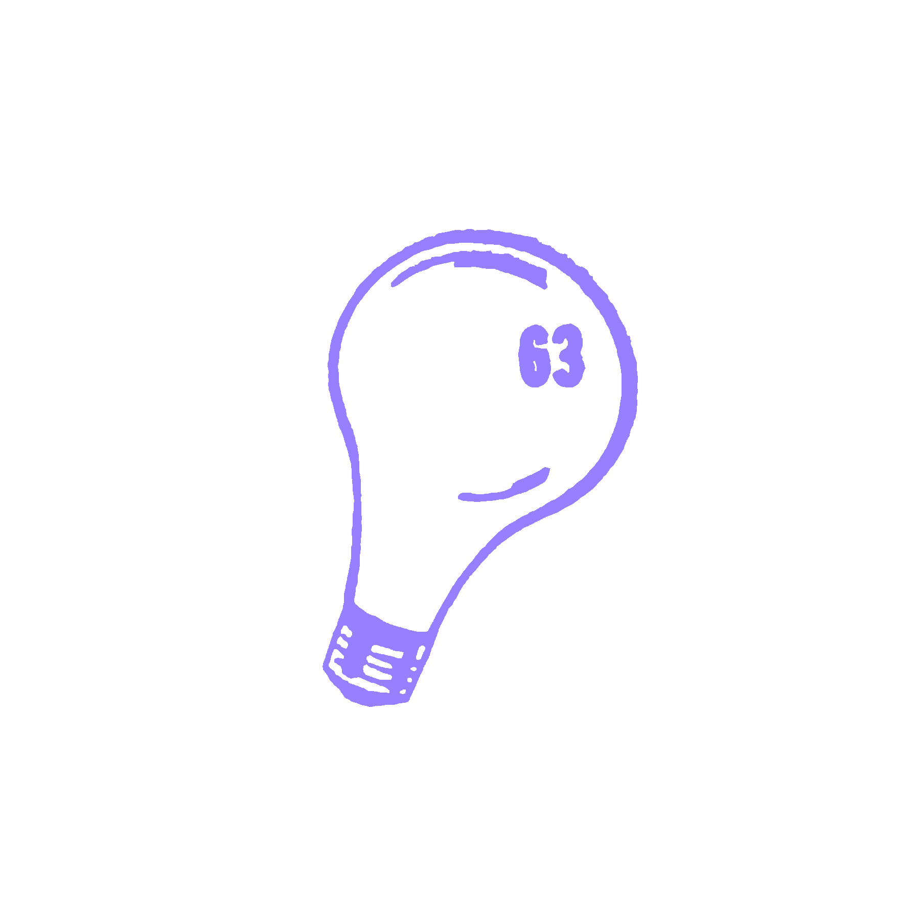


To add to the toolkit, we created a dingbat font with whimsical symbols that layer over the logo for special events and workshops. Mimeograph purple — a nod to another “joy machine” — accents the palette. Drawing from the wonderful, multi-sided nature of Joy Machine, we dove into the studio’s collection of found objects for symbol inspiration. These playful symbols complement the logotype, each revealing a small moment and indicating different workshops or public engagements within the space, creating a visual language that’s both cohesive and adaptable to whatever brings joy.
Activation


Together, we decided on business cards that felt special. Elegantly produced with foil stamping and embossing on a textured white cardstock, the design featured a minimal and considered design with “JOY MACHINE” at the center. Along the outer edges information is rotated to emphasize the multi-sided nature of the space and brand.

Style Guide
Our style guide organized Joy Machine’s design toolkit into clear, actionable guidance that highlighted the need for varying levels of expression and execution. The guide established an asset matrix of logo and layout applications that evolve over time — from upcoming invitations and events to retrospectives and archives of in-person experiences. The visual tonality guide for various identity applications makes design choices easier to understand and implement.


Design Details


