Berwyn
Nothing Like a Suburb
After 9 years of running the Why Berwyn? campaign, the Berwyn Development Corporation came to us for help revitalizing the city's brand.
Located west of Chicago, the city measures just 3.9 square miles, but what it lacks in size, it more than makes up for in character, diversity and delightfully eclectic community culture. Home to long-time families, young couples, artists and entrepreneurs, and seasoned business owners alike, Berwyn strikes that rare balance of progressive spirit and old school charm.
In short, it's nothing like a suburb.

CAMPAIGN DESIGN
The project kicked off with intensive research. With hundreds of Chicagoland residents responding to our surveys and public intercepts, it became clear that few outside of Berwyn understood the city at all. Most people assumed Berwyn was just another suburb. Our campaign set the record straight.


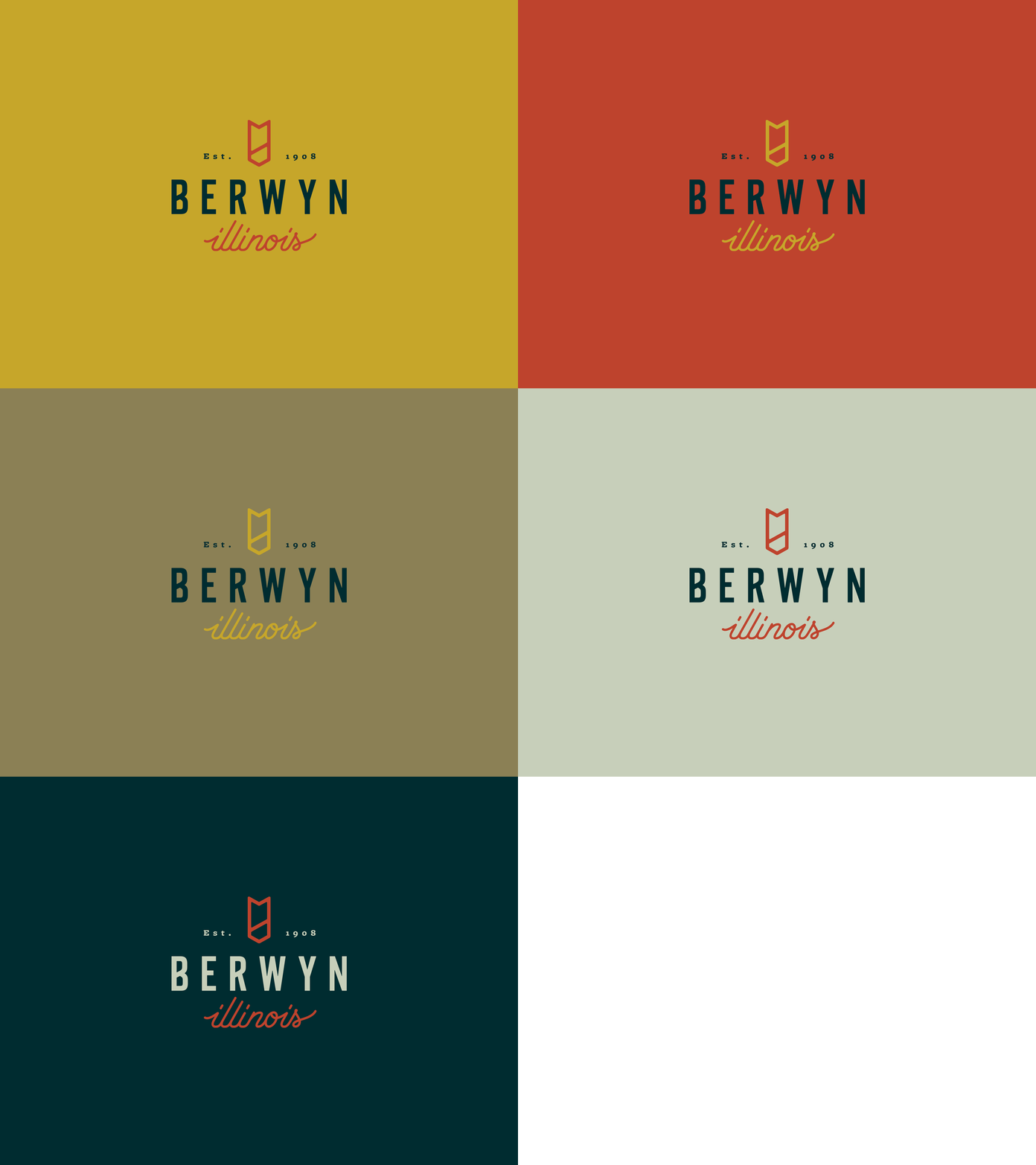
Starting with a high impact, custom lettering system, called — what else? — Berwyn Sans, we created custom logotypes for the city and each of its four business corridors. A subtle, lived-in palette, combined with slice-of-life imagery, reflects the city’s unpretentious, storied and “urban-ish” sensibility.


OUTDOOR CAMPAIGN
The campaign centered on a series of direct, succinct taglines, delivered with tongue planted firmly in cheek. Together with type, color and imagery, the no-nonsense yet light-hearted messages paint a clear picture of who and what Berwyn is.
The billboards and posters went up over high traffic intersections and CTA platforms, places where Chicagoans would have a second to consider and then reconsider their ideas about Berwyn.


IMPACT
“The campaign has raised awareness of our great location, remarkable bungalows, nightlife, thriving business base and warm, welcoming attitude. Our new look refines our branding in a clever way.”
— Robert Lovero, Mayor of Berwyn
The response to the campaign was overwhelming. Instagram users tagged photos of billboards, residents requested custom-designed flags and comments came pouring into social media and local news sites to thank Berwyn’s leaders for taking a chance on a cheeky campaign and stoking some civic pride for this tiny, colorful town that is, and always will be, nothing like a suburb.
